Basics
The Line
The line is a distinctive graphic device that is often used in our communications. It is a key component of our brand and serves to draw attention to titles and headings, as well as being part of our standardised sub-brand treatment. It should be used to create order and functions as an element of authority unique to DMCC. Some guidelines around its use include:
- The line should be paired with titles and headlines only and never to be used on its own
- The line can be used on white, dark blue and imagery
- The predominant colour of it is Gem Turquoise
- The length and thickness of the line relates to the size of the typography it is paired with, as shown below
Size and positioning
Print and digital advertising
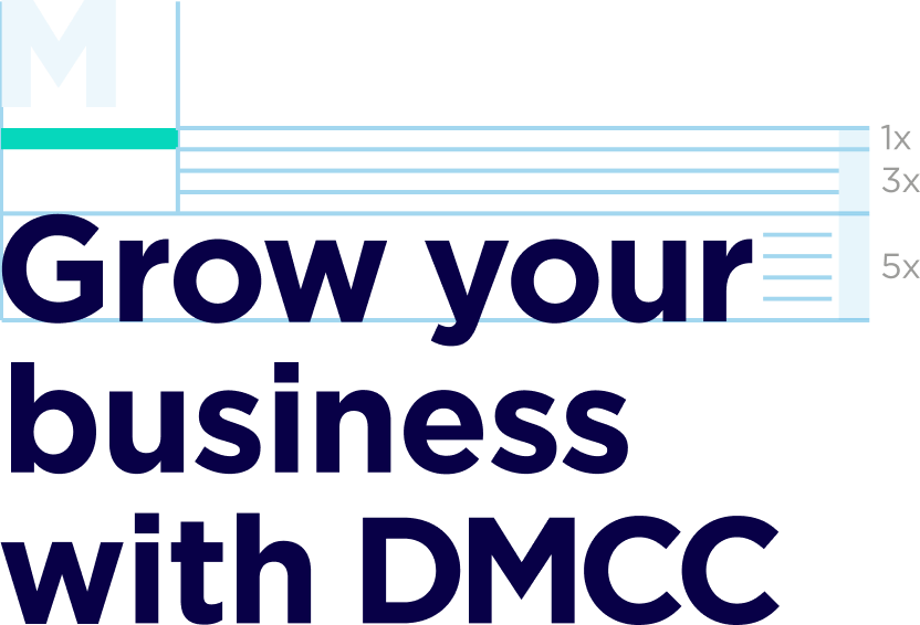
The following diagrams give the correct specification for the size and weight of the line. For printed applications and digital advertising, it should always be set up as follows:
- Once the headline size is established, the length of the line should be set to 155% the width of an uppercase 'M'
- The weight of the line should be equivalent to 1/5 of the headline cap height
- For printed applications, the line should always be left aligned, and positioned 3/5 of the cap height above headlines

Use with sentence case headlines
155% width of uppercase M

Use with sentence case headlines
155% width of uppercase M