Website
Spacing and layout
An adaptable display ensures a consistent, positive user experience across all devices, making our website accessible to a wide range of users. These principles act as a helpful guide.
Spacing
Just like your colour scale, working from a defined spacing system allows you to work faster and more consistently. Consistent and scalable spacing helps you eliminate guesswork whilst designing and developing because you're designing with a limited set of options.
| Size (16px base) | Pixels |
| 0.25rem | 4px |
| 0.5rem | 8px |
| 0.75rem | 12px |
| 1rem | 16px |
| 1.25rem | 20px |
| 1.5rem | 24px |
| 2rem | 32px |
| 2.5rem | 40px |
| 3rem | 48px |
| 4rem | 64px |
| 5rem | 80px |
| 6rem | 96px |
| 8rem | 128px |
| 10rem | 160px |
| 12rem | 192px |
| 14rem | 224px |
| 16rem | 256px |
Grid layouts
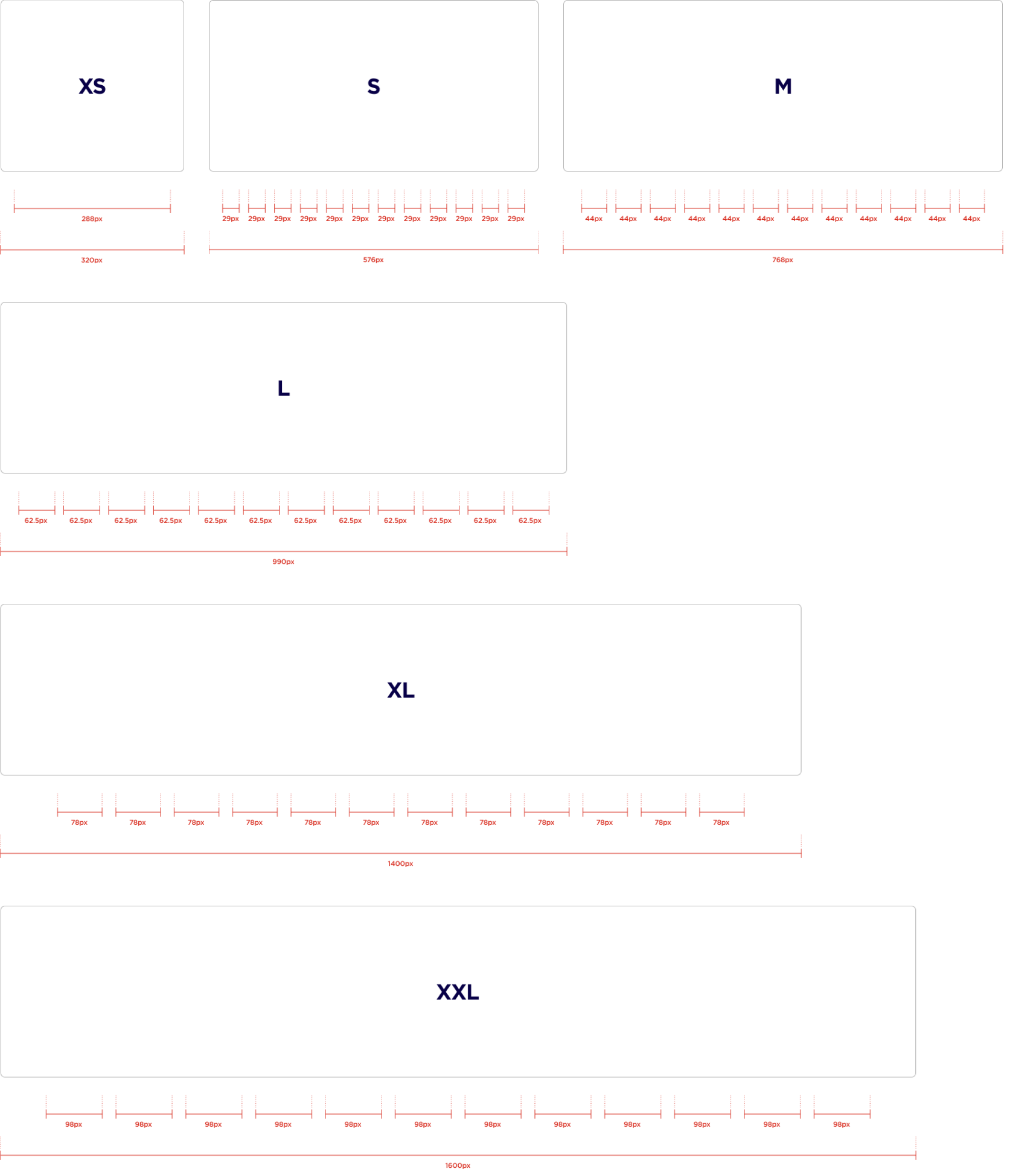
Layout grids define structure, hierarchy, and rhythm in your design. Working from a defined layout system allows you to work faster and more consistently, removing guesswork as you lay out responsive designs.
| Name | Breakpoint | Container size | Columns | Margins | Gutters |
| S | 576 - 767 | - | 12 | 24 | 16 |
| M | 768 - 989 | - | 12 | 32 | 16 |
| L | 990 - 1279 | - | 12 | 32 | 16 |
| XL | 1280 - 1599 | 1200 | 12 | - | 24 |
| XXL | > 1600 | 1440 | 12 | - | 24 |
