Basics
Type usage
Our type style is straightforward, authoritative and approachable. The following settings give baseline principles for consistent typographic application across the DMCC brand. The following points should also be considered:
- Larger sized typography should be set more tightly than smaller sized typography. Optical adjustments to the below settings should be made when needed to compensate for this.
- It is important to limit the amount of different sizes, weights and styles in any single application. As a baseline guide, two weights and three sizes should be enough for most applications.
- The proportional type sizes specified below should be used as a guide when determining typographic hierarchy in relation to the DMCC logo.
Type setting
Print and digital advertising

Uppercase typography
Used on primary headlines only. Uppercase headlines provide the strongest typographic link to the DMCC master brand, but should be used sparingly to ensure they provide impact and clarity. Uppercase typography should be reserved for the primary headline in any given communication.
Example uses include:
- Print and digital advertising headlines
- Brochure covers
- Social media tiles
- Exhibition Graphics
DMCC uppercase typography is set more tightly than standard headline or body copy, as shown above, to create a solid compositional unit within layouts.
- Leading should be set automatically at 85%
- Tracking is set to -20
- Kerning is set to Metric
- Word spacing should be set 80% within the justification panel.
- In all cases, headlines should be left-aligned, except for on the DMCC website.

Secondary headline setting
Secondary headlines within a communication should be set in sentence case, as shown above.
-
Leading should be set automatically at 100%
-
Tracking is set to -10.
-
Kerning is set to Metric
-
Word pacing should be set 80% within the justification panel. In all cases, headlines should be left-aligned, except for on the DMCC website.
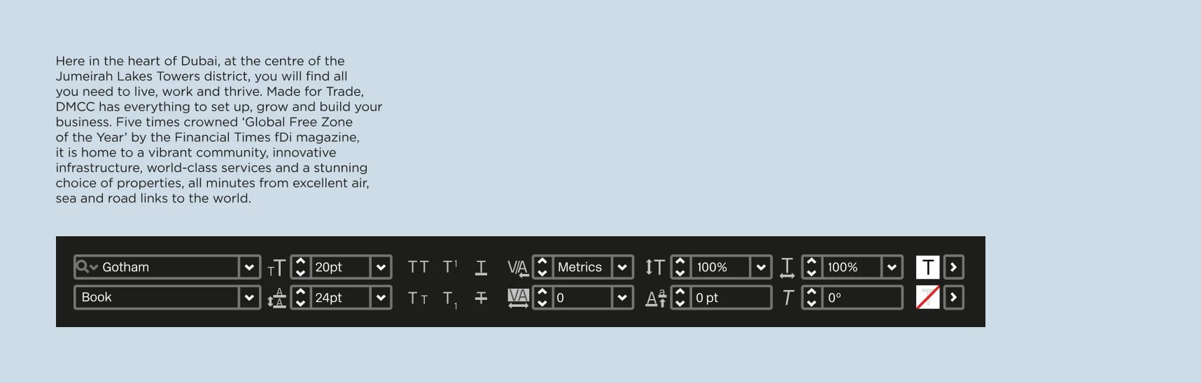
Body copy setting
Body copy within a communication should be set in sentence case, as shown below.
-
Smaller copy should always be set more openly than larger copy. For body text, leading should be set automatically at 120%
-
Tracking is set to 0
-
Kerning is set to Metric
-
Word pacing should be set 80% within the justification panel. Whenever possible body copy should be left-aligned
Proportional type sizes
For consistency and clarity across DMCC communications, the following proportional type sizes should be used to establish typographic hierarchies in relation to the DMCC logo. The size relationships specified below can be applied to different styles and weights including headlines, subheaders, secondary text and body copy.
It is important to limit the amount of different sizes, weights and styles in any single application. As a baseline guide, two weights and three sizes should be enough for most applications.

- The height of the 'D' in the DMCC logo, is defined as 100%. The cap-heights of the other type sizes are defined in relation to this.
A flexible system
Working with the proportional type sizes given above on a simple grid system offers a good degree of flexibility within a consistent framework, as shown below.


Offset headline treatment
Offsetting headlines offers a more fluid approach to typography, that can be used selectively on primary headlines to add dynamism and interest to DMCC layouts. The key principles of this approach are outlined below.

- The logo is scaled to match the height of the margin
- In this example, the offset headline cap height is equal to the height of the 'D' in the DMCC logo
- Supporting copy is set at 25% of the height of the 'D' in the DMCC logo. Call to actions are set in bold within the body copy text block
- Including the DMCC logo and MFT lock-up, there are three type sizes in total used within this layout
- We do not use the line device for offset headline treatments